Happy Friday (or Saturday at this point), everyone! I don’t know about you (but I’m feeling twentyyyy-twoOoOo!) Okay, that was unnecessary. I’m sorry. But, I need this weekend more than anything after the week I’ve been having. Any good Labor Day weekend plans? Mine are still in the making, but as long as I’m seeing my friends, I’ll be happy as a clam. (Where did that expression come from anyway?)
This morning I’m here to talk about something I’ve gotten a lot of questions about over the years: “How do you edit your photos?” Some of my friends will ask and just stare at my phone in awe as I plow through the edits at top-speed. Not to be confused with sounding cocky; it’s just something I’ve mastered, because it’s a part of my day-to-day life.
Editing is arguably as important as the photography itself, in my opinion. There have been so many pictures I would never have looked at again had I not tried out some edits on them. For example:
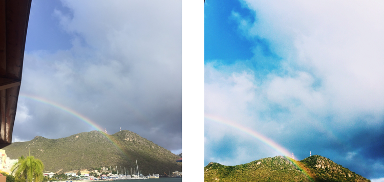
I was so disappointed that I didn’t get any good pictures of this awesome double rainbow I saw in St. Maartin, but then I decided to give it a try and see what I can do. Now, it’s one of my favorite pictures from my trip. Before you decide to scrap a picture, remember that editing can sometimes save a picture (just remember that this is not always the case).
When it comes to editing, you’re going to acquire a certain style over time. I love this, because it allows people to recognize your pictures without necessarily knowing it’s yours. For instance, there have been a few times people have said to me, “I knew that was your picture on Instagram before I even saw your name.” I love that! I go through different phases from time to time, but I still maintain a somewhat recognizable look to my photography.
I’m now going to go over the different types of edits I have used and how to achieve these looks. For starters, I only use Apps to edit my pictures. That’s right. I use my iPhone. I’m sure any photography critic would be shaking her or his head at me right now, but it’s the easiest method I have found so far. Plus, my 4+-year-old Macbook is having a tough time handling any new software. The three Apps I use and will be going over in this post are: VSCO, Afterlight, and ColorStory. They look like this:

How I Edit My Pictures
Happy Friday (or Saturday at this point), everyone! I don’t know about you (but I’m feeling twentyyyy-twoOoOo!) Okay, that was unnecessary. I’m sorry. But, I need this weekend more than anything after the week I’ve been having. Any good Labor Day weekend plans? Mine are still in the making, but as long as I’m seeing my friends, I’ll be happy as a clam. (Where did that expression come from anyway?)
This morning I’m here to talk about something I’ve gotten a lot of questions about over the years: “How do you edit your photos?” Some of my friends will ask and just stare at my phone in awe as I plow through the edits at top-speed. Not to be confused with sounding cocky; it’s just something I’ve mastered, because it’s a part of my day-to-day life.
Editing is arguably as important as the photography itself, in my opinion. There have been so many pictures I would never have looked at again had I not tried out some edits on them. For example:
I was so disappointed that I didn’t get any good pictures of this awesome double rainbow I saw in St. Maartin, but then I decided to give it a try and see what I can do. Now, it’s one of my favorite pictures from my trip. Before you decide to scrap a picture, remember that editing can sometimes save a picture (just remember that this is not always the case).
When it comes to editing, you’re going to acquire a certain style over time. I love this, because it allows people to recognize your pictures without necessarily knowing it’s yours. For instance, there have been a few times people have said to me, “I knew that was your picture on Instagram before I even saw your name.” I love that! I go through different phases from time to time, but I still maintain a somewhat recognizable look to my photography.
I’m now going to go over the different types of edits I have used and how to achieve these looks. For starters, I only use Apps to edit my pictures. That’s right. I use my iPhone. I’m sure any photography critic would be shaking her or his head at me right now, but it’s the easiest method I have found so far. Plus, my 4+-year-old Macbook is having a tough time handling any new software. The three Apps I use and will be going over in this post are: VSCO, Afterlight, and ColorStory. They look like this:
VSCO is my absolute favorite. Now that I’ve used it more and more, I don’t really even need the other Apps I have in order to get the look I am going for. I will note that this App can be very difficult to navigate. It’s not necessarily hard to figure out; it’s just a little messy. For the sake of this post, I am going to explain these edits as if I were using one of these three Apps, so if you’re not trying to use these, this may not be of much help to you.
Let’s start with this mediocre picture of infused water I took at work.
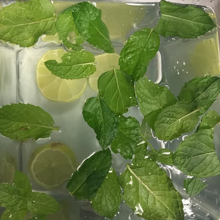
BORING.
If I were editing the picture for my personal Instagram, this is what I would do:
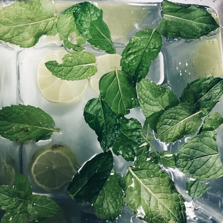
To achieve this look, you’re going to have to change a few settings in the VSCO App. For any pictures I currently have, I use the HB1 filter in the ‘Hypebeast‘ pack. (You can download this pack for free in the “buy” section of the App.) This is my favorite, because it’s cool, crisp, and clean. I then changed my settings accordingly:
Exposure: -1
Contrast: +3
Temperature: -1
These settings achieve a more ‘blue’ hued look, which is what my current style is. I used to edit my photos with a more ‘green’ base:

Personally, this is a bit too bright for me, but it’s definitely more of what you see when people use VSCO. Because this filter (C1 in the ‘Vibrant’ pack) comes with the App when you download it, it’s more commonly seen. I used the following settings:
Exposure: +1
Contrast: +2
Saturation: -1
As you can see, this is very different from the other picture, but still has a lot of flair to it. If I were editing this picture for my blog Instagram, I would do something more like this:
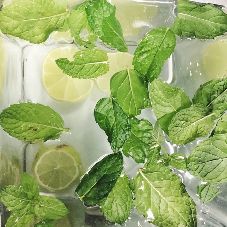
For my blog Instagram, I like to have more bright/white undertones, as you can see. For these pictures, I use ColorStory withthe ‘Lightbright’ filter. From here, I then take the saved version from ColorStory and open it in Afterlight. Afterlight is a little more user-friendly. The scale, however, is larger, so it’s a little harder to get the exact numbers I’m about to specify (once you download the App, you’ll understand what I’m talking about):
Clarify: 43
Brightness: 27
Contrast: 22
Saturation: -21
Now, let’s move onto another picture. Here is a picture of my breakfast I took when I went out to eat the other day. At first glance, this looks like one of those kind of unappetizing pictures you will see people post from time to time – unaware that their food is well… kind of offensive to the eye:

Not to worry, I will save your poor eyes from this bad visual. I’m going to go in the same order as the last set of pictures, starting with how I would edit this for my personal Instagram currently:

Isn’t that so much nicer on the eyes?! Again I used HB1 in the ‘Hypebeast’ pack on VSCO:
Exposure: -2
Contrast: 2
Saturation: -1
Temperature: -2
I also straightened out the picture a little.
I just love how simple and toned down it appears. The trueness of the colors still remains, but in a more dulled-down, calm manner.
Here is how I another example of how I used to edit for my personal Instagram:

What I love about this edit is the vibrancy of the colors. Everything is very bright and contrasting thanks to C1 on the ‘Vibrant‘ pack and:
Exposure: -1
Contrast: 1
Temperature: -1
Again, I also straightened out the picture.
Another example of how I would edit this picture for my blog Instagram:

Because of the intensity of the colors, I may not put a picture like this on my blog account. I like that white, minimal look, and this does not make the cut. However, this is how I would edit the picture if I was going to use it. Again, this is using the ‘Lightbright’ filter in the ColorStory App:
Brightness: -28
Contrast: 13
I straightened this out on Afterlight, as well. I actually prefer the straightening tool on this App as opposed to VSCO, because the grid in VSCO throws off the way I see the picture.
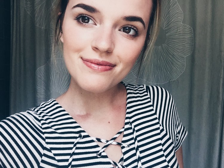
People are a little bit harder to edit. You don’t want to over-edit and give a fake appearance, but you also want to highlight the key features in a photo. There are a lot of Apps out there to actually enhance the person, the way one would use Photoshop, but I am here to strictly talk about the visual components of the picture itself – not the person in it.
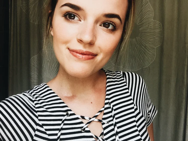
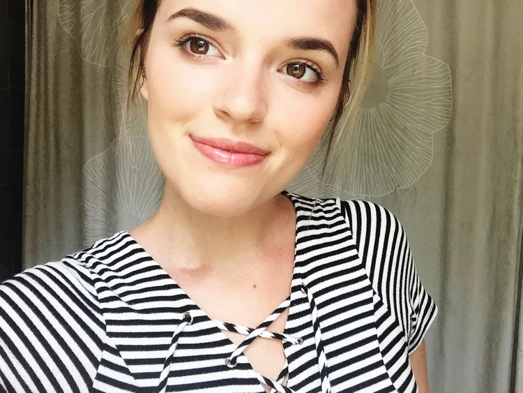
Here is the original picture of myself I am using for the purpose of this post:
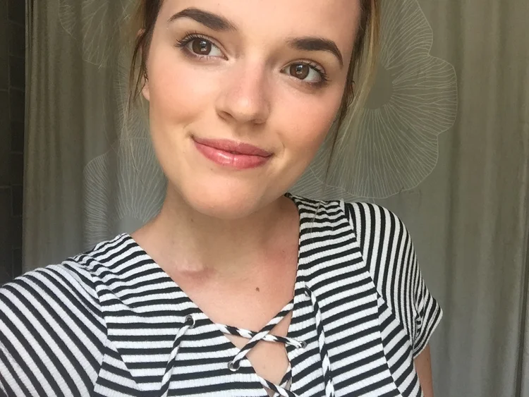
Hey, it’s me! While I do think the iPhone did a good job at making this picture clear, there are some things I would do to enhance it.
For my personal Instagram:
See what I mean when I talk about that ‘blue’ look I’m going for? Again, my trusty HB1 in the ‘Hypebeast’ pack on VSCO along with:
Exposure: -2
Contrast: +1
Saturation: -1
Temperature: -1
I love the hues and sharpness of this. As cheesy as it sounds, they gives a little mystery to the picture.
Here is how I would edit this picture if I were using the style I used to go with:
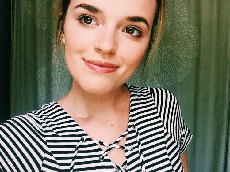
Personally, I think this is way too green for the type of background I have in the picture, but this is a look some people try to achieve. This was using C1 in the ‘Vibrant‘ pack on VSCO and:
Exposure: -1
Contrast: +1
This next edit I have not used in any of the other pictures, but here is another look I enjoy using when it comes to editing pictures of people:
This edit was achieved using A6 in the ‘Analog’ pack. I believe this one is also available for free in the “buy” section of VSCO. Either that, or it comes with the others when you download it. I particularly like this one for myself, because it really brings out the brown hues, which is particularly beneficial to my features – such as my eyes and hair.
Finally, one last example of how I would edit for my blog account:
I love the vibrancy of this one. It incorporates the white highlights of the picture, the contrasting black stripes of my dress, and also the brightness of my eyes – all great elements to this photo. Once again, I used the ‘Lightbright’ filter on ColorStory with the following settings:
Brightness: -44
Contrast: 14
This actually may be my favorite edit, due to how loyal it remains to the original.
As you can see, there is a wide array of styles and options that comes with editing. My top advice would be to just practice, practice, practice. You will get a feel for what you do and don’t like, and toggling with the various elements really makes a difference. I can’t tell you how many times I will sit there with just one element of a picture (say, exposure), and go back and forth between one single increment trying to figure out which looks best. Once you see it, you will know though. It just takes time and experience.
I know this was a lengthy post, but I wanted to give you all as much information as I could, especially because I know everyone has varying tastes. I also know I wanted more information starting out and had to figure it out on my own. So, if I can save you some of the hassle and effort, why not? If you have any questions, please don’t hesitate to ask!
Truly,
Taylor